



March 26, 2026
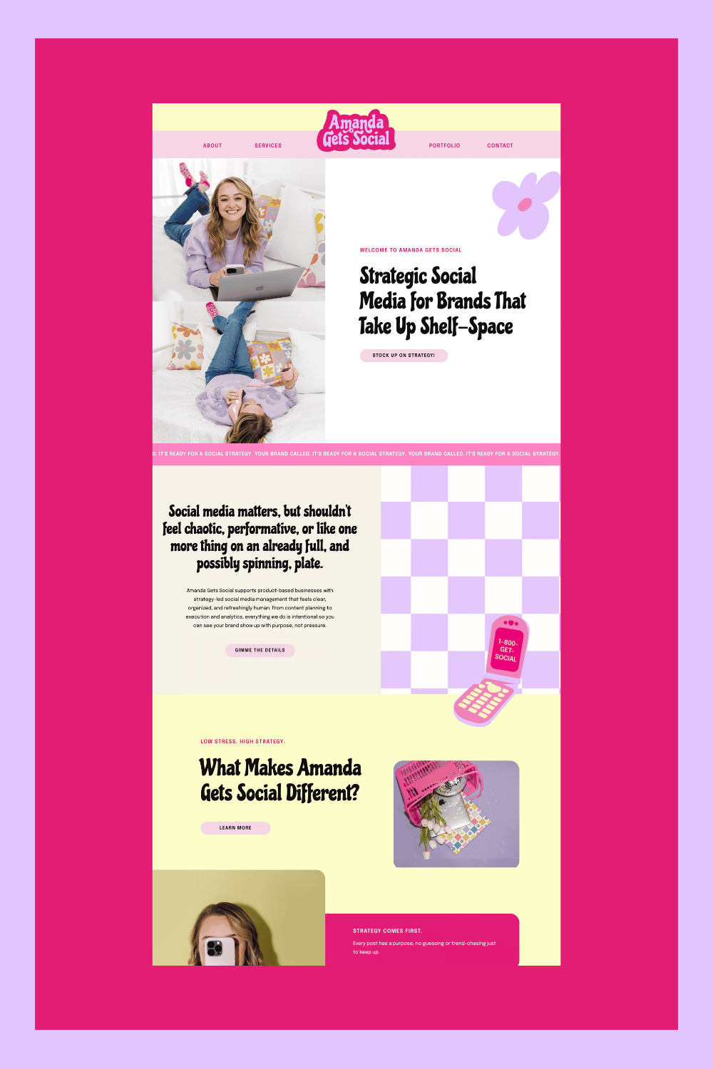
A bold, vibrant brand built to stand out in a saturated social media space.
Amanda Russell is the founder of Amanda Gets Social, a bold, Y2K-inspired, creative social media agency. With a passion for helping CPG brands show up confidently online, Amanda brings a fresh, energetic approach to digital marketing.
After three years in business, Amanda was ready for an elevated brand presence that truly reflected the energy and creativity behind her work. Like many business owners, she had spent so much time pouring into her clients’ brands that her own had taken a back seat.
Together, we reimagined her brand to feel just as dynamic and engaging as the content she creates. Through a vibrant color palette, playful icons, bold typography, and touches of Y2K-inspired design, we built a brand that feels fun, confident, and unmistakably her. The result is a refreshed identity that not only elevates Amanda Gets Social, but also positions her as a standout creative in the social media space with a brand that’s just as memorable as the work she delivers. See the transformation
The Struggle
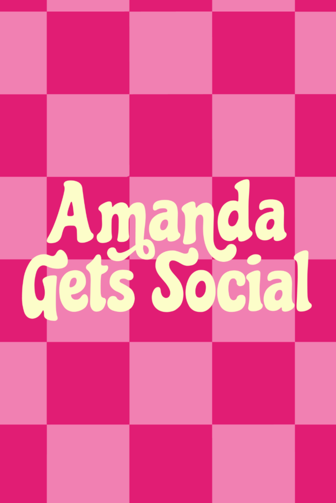
As Amanda’s business grew, so did the disconnect between her work and how her brand was showing up. She was creating bold, engaging content for clients… but her own brand didn’t carry that same level of personality or impact. There wasn’t a strong visual identity anchoring her presence, which made it harder to stand out in a space that’s already incredibly saturated.
She knew she wanted to attract higher-level clients. She wanted her brand to feel fun, confident, and scroll-stopping. But without a cohesive brand system, everything felt a little scattered.
The energy was there.
The expertise was there.
The branding just needed to catch up.
The Goal
We set out to create a brand that felt bold, playful, and with a little Y2K flair. This was about building a brand that felt expressive, vibrant, and full of personality, while still being strategic and elevated enough to attract dream clients.
The vision was clear:
- Create a high-energy, scroll-stopping visual identity
- Infuse personality into every touchpoint
- Build a cohesive brand system that feels fun and intentional
- Position Amanda as a confident, go-to creative in her space
And of course, we weren’t just designing a logo (we never are 😉). We built a full brand identity system designed to grow with her.
The Solution
We leaned all the way into bold.
This brand is rooted in vibrant color, playful contrast, and a slightly nostalgic, Y2K-inspired edge that immediately catches your attention. Every design choice was intentional, nothing felt random or overly trendy. It was all about creating a look that feels alive.
The typography pairing brought structure and clarity, grounding the more expressive elements so the brand still feels polished and strategic. From there, we introduced graphic elements, textures, and layout styles that add movement and energy across social, web, and marketing materials.
The result is a brand that doesn’t just look good, it feels like an experience.
Everything works together:
- A bold, personality-driven logo suite
- A vibrant, high-contrast color palette
- Elevated yet playful typography pairings
- Dynamic graphic elements that create consistency without feeling repetitive
It’s cohesive, it’s confident, and most importantly, it finally reflects the level Amanda is operating at.
The Results
Amanda now has a brand that actually matches her energy.
Her visuals are instantly recognizable. Her content feels more aligned. And showing up online feels easier because she’s no longer guessing, she has a clear, strategic foundation to work from.
This is the kind of brand that turns heads, builds trust, and attracts the right people.
Because when your brand reflects your true level… you don’t have to try so hard to be truly seen.
Is your brand bold enough to stand out or are you blending in?
Your brand is either pulling dream clients in or quietly pushing them away; there's no in-between. In 4 minutes and 10 questions, you'll find out exactly which one yours is doing, what's holding it back, and one shift you can make.


